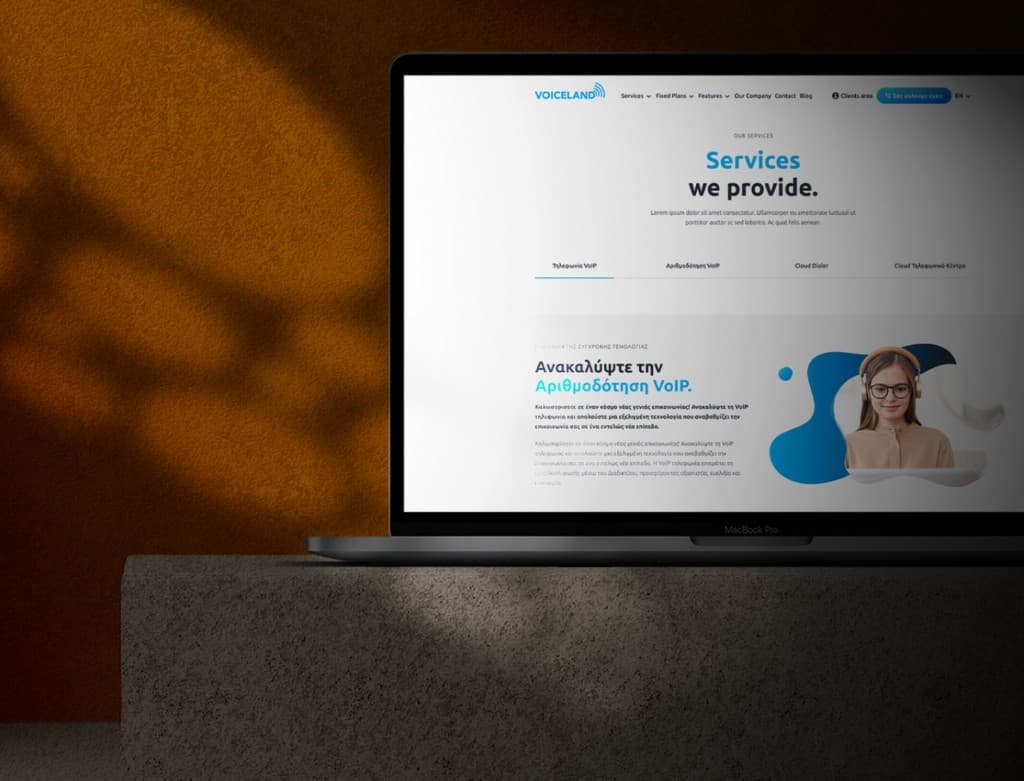
Voiceland · cloud telephony redesign
Rebuilding a Greek cloud telephony site from the information architecture up: a mega menu that finally fit the product, a pricing page made to be scanned, and my first time leading a junior designer through a live client engagement.
Scope
At a glance
The brief
Voiceland is a Greek cloud telephony provider, PBX, call routing, conferencing, analytics, serving everyone from freelancers to large companies. The site worked, technically. What it did not do was reflect how much product sat behind it. The information hierarchy did not match the depth of what Voiceland actually offered, the pricing page lost people before they converted, and the whole experience felt smaller and older than the company the brand wanted to be.
I came in as senior external design partner and project manager. I owned the full UX architecture of the redesign, and I directed a junior designer on the execution.
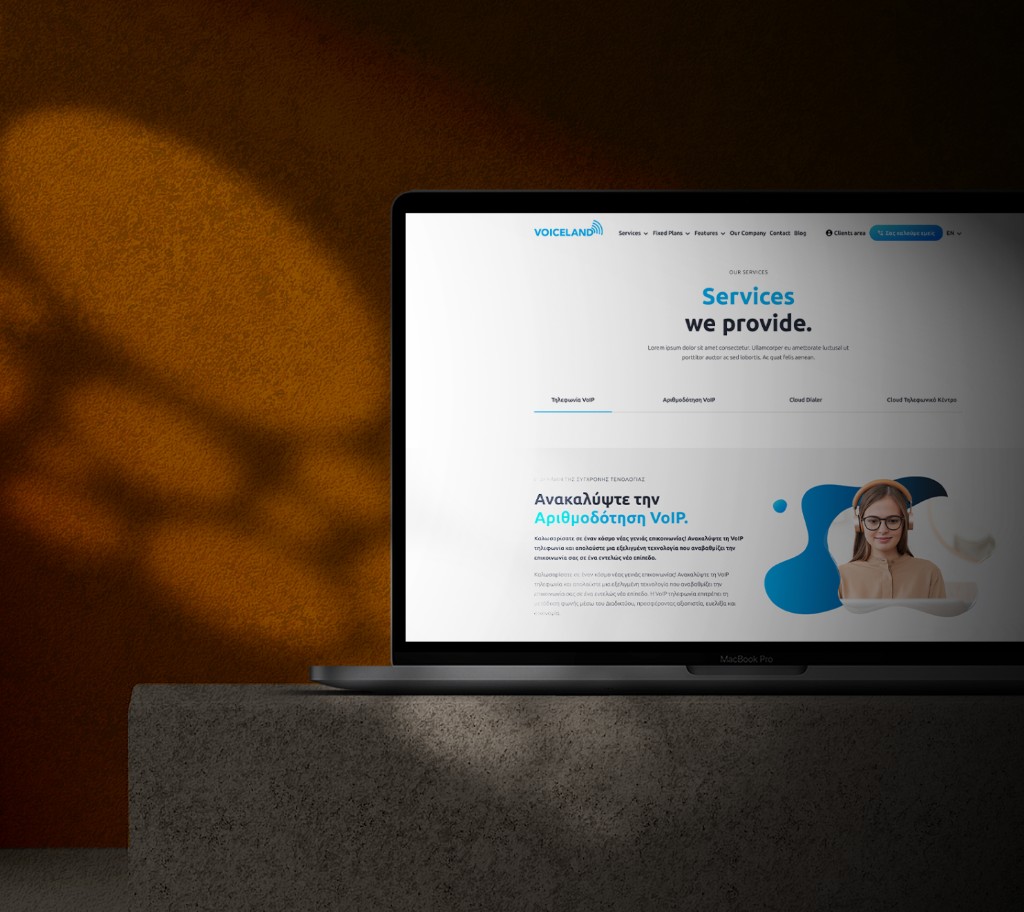
The navigation was the real problem
The single decision that changed the most was rebuilding the navigation as a mega menu. Voiceland's range, VoIP plans, conferencing, call recording, PBX management, remote numbers, could not live in a flat nav bar. Flatten it and you either bury half the options or crush them into the header with equal weight, which is the same as having no hierarchy at all.
So I grouped the services the way a customer actually arrives, by who they are and what they need, individual, team, enterprise. The most-searched features surfaced immediately. A visitor could work out where they belonged before they committed to a single page. Navigation is not decoration on top of a product. On a site like this it is the product, because it is the first thing that tells someone whether you have what they came for.
Pricing, made to be scanned
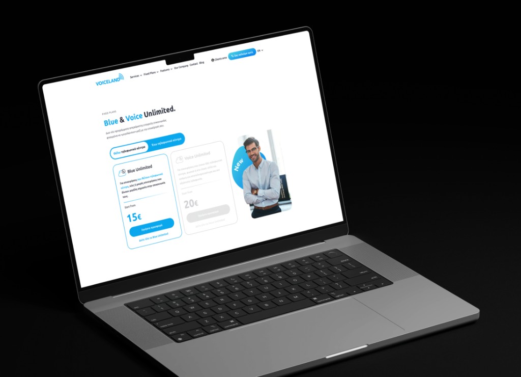
The pricing page got the same treatment. Feature rows grouped by category instead of listed flat, so someone could scan across the tiers horizontally and find the plan that fit their scale without reading every cell. Nobody chooses a phone system by studying a spreadsheet line by line. They scan, they compare, they decide. The page had to let them.
Leading someone else, for the first time
This was the first time I led another designer on a live client engagement, and I structured that as deliberately as I structured the information architecture. I owned the upstream work, the research, the stakeholder sessions, the rationale I had to present and defend. She owned execution inside that structure. Every screen was audited before it went to development.
I did not fully know whether it would work. Handing execution to someone else while staying accountable for the outcome is a different kind of nerve than doing all of it yourself. It worked. The project shipped, and the team kept using the system after I rolled off, which is the only real test of whether the structure you left behind was sound. That is what I took from Voiceland. Owning the thinking and trusting someone else with the making is a skill of its own, and you only learn it by doing it and being a little uncomfortable the whole way through.
Gallery
Outcomes