
What didn't exist when I arrived
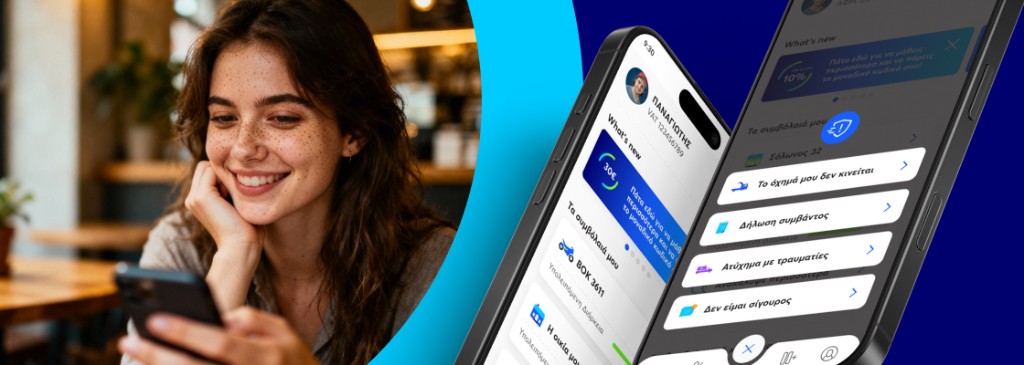
Interamerican is Greece's largest general insurer — fifty years of institutional history, millions of policies in force, and no consumer mobile app. They wanted to launch one. They brought me in via Code.Hub to make that happen.
When I arrived in 2023: no design system, no consistent UX language across any of their existing digital surfaces, and no internal product designer dedicated to consumer experience. I was the only designer in the room. The mandate was simple in scope and impossible in shape: build a consumer mobile insurance app for the Greek market, ship the MVP in six months, and do it inside the operational pace of a fifty-year-old institution.
The scope expanded as the work landed. By the second year, I was the design lead across three platforms — Anytime mobile (iOS and Android), MyAnytime (the consumer web platform), and MyInteramerican (the broader Interamerican web ecosystem). And the rollout had stretched beyond Greece: Cyprus MVP shipped, then Romania MVP began.
Trust as the core problem
Greek customers don't see insurance the way Western fintech assumes they do. Insurance isn't a tool people engage with. It's a tax they pay because they're required to, a piece of paper that lives in a drawer until something bad happens, and an interaction loaded with negative emotional weight before the user has even opened the app.
The hardest UX problem on Anytime wasn't features. It was making a digital insurance interaction feel as safe as a branch visit — for a user base that, until very recently, would only have engaged with insurance in person, on paper, with a witness and a stamp.
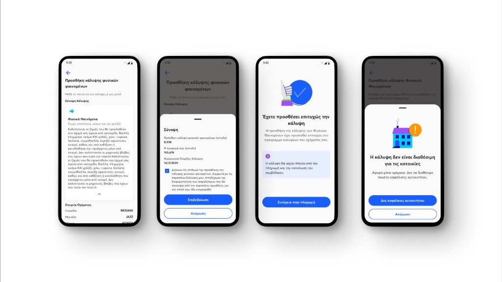
Every meaningful design decision on Anytime came back to this. Iconography choices that signalled institutional permanence rather than startup energy. Confirmation patterns that mimicked the closure of a paper transaction. Language that erred on the side of formal precision rather than casual brevity. Microinteractions that slowed the user down at high-stakes moments rather than rushing them through.
The first big call
The pressure was to ship the MVP in six months. The textbook answer was to build the design system first, then build the app on top of it. That would have taken eight months on its own. So I made the call early: ship Anytime fast, build the design system in parallel as patterns emerged.
Every reusable component got promoted into the system the moment it was used a second time. Every flow that diverged from an existing pattern triggered a discussion with engineering: was the divergence a real difference, or were we forking the system unnecessarily? Three months in, the system had enough density to start carrying the work. Six months in, the Greece MVP shipped. The system shipped underneath it.
How I worked as the only designer
Three operational moves did most of the heavy lifting.
Constraints upstream of design. Every flow started with a session with backend, payments, claims, and (for road assistance) the operational team that handles real roadside callouts. Decisions about what was technically feasible, regulatorily required, or operationally constrained got made before any screens existed. By the time I was drawing wireframes, the structure was already half-decided. This is the move that lets one designer keep up with three engineering teams.
Own research where there isn't a function. Interamerican didn't have a dedicated UX research function for the Anytime team. I ran my own research — competitor audits across Greek and European insurers, qualitative interviews with policyholders during scoping, usability testing with real users on critical flows (claims, road assistance) before launch. Where I couldn't run formal research, I layered modern AI tools — NotebookLM for synthesising internal documentation, Claude and Cursor for accelerating prototyping cycles, Perplexity for competitive market scanning — explicitly as a stand-in, never as a substitute.
Negotiate scope. The single highest-leverage skill in solo design at scale isn't how fast you draw — it's how often you say no to features that would fragment the system. Every feature request got tested against the same question: does this make the product more coherent or more fragmented? Coherent went on the roadmap. Fragmented didn't.
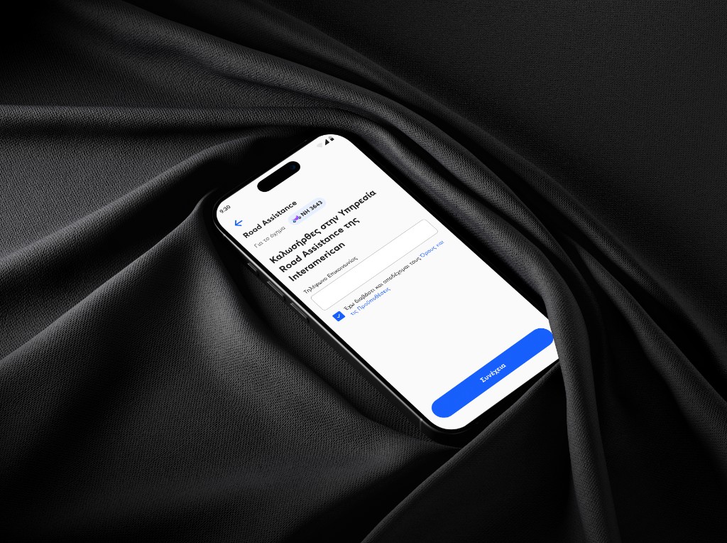
Road Assistance — designing for panic
The flow I'm proudest of is Road Assistance. It's the one users open during or after an actual roadside emergency — a flat tire, an accident, a breakdown on a motorway at midnight. The user is stressed. The user is in a place they don't want to be. The user has never used the flow before, and they're using it now because something has gone wrong.
The design discipline here isn't reducing clicks. It's reducing cognitive load to almost zero. The first screen had to ask only the question that mattered most — where are you, what's happened — and answer everything else by default or context. Location detected automatically with manual override. Vehicle pre-populated from policy data. Service type narrowed to the four most-requested options with an "other" as escape hatch. Confirmation patterned to feel like a person on the other end had received and acknowledged the request, not like a form had been submitted into the void.
The result is a flow that takes under thirty seconds in the worst-case real-world scenario, and that survives being used by someone whose hands are shaking. That's the bar. Anything slower is the wrong design for this user, in this state.
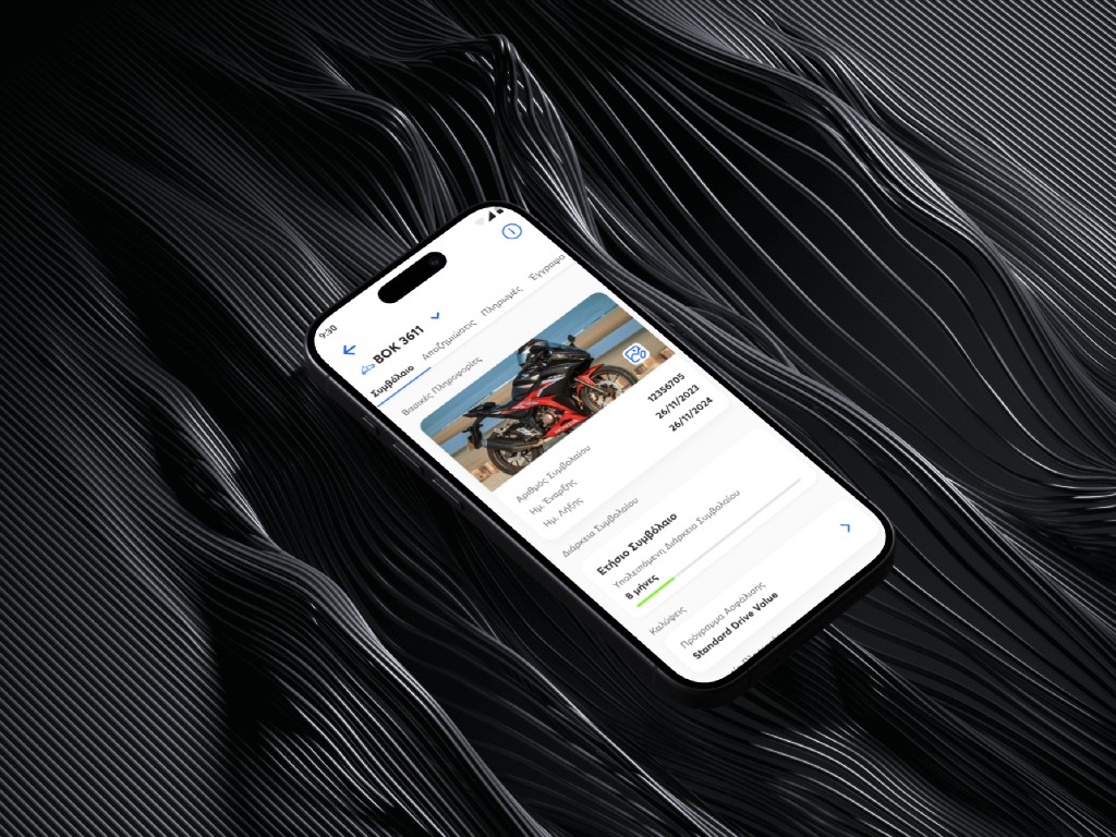
Claims — multi-day paperwork to same-day in-app
The claims flow, traditionally, was a multi-day process. Phone calls. Forms. Branch visits. Witness signatures. Document scans. The shipped Anytime claims flow brought it down to same-day in-app submission — photos uploaded directly from the device, structured questions replacing free-form forms, status updates in the user's hand instead of in a phone call queue.
The design lift here wasn't visual. It was structural — replacing every paper-based step with a digital equivalent that satisfied the same regulatory and evidentiary requirements, and translating insurance language into something a stressed user could parse on a phone screen.
Greece, then Cyprus, then Romania
Once Anytime Greece v2 shipped, the system was strong enough to support international rollout. Cyprus MVP launched on the same design system with country-specific flows — Cyprus's local insurance regulation differs from Greece's in claims handling, policy structure, and disclosure requirements. Romania MVP is currently underway with the same playbook.
The constraint that made this possible: the design system was built to absorb regulatory variance without forking the visual or interaction language. Country-specific flows live as configurations on shared components, not as parallel codebases. That's the move that turned Anytime from a Greek product into the Interamerican consumer mobile platform.
Results
- 150,000+ downloads in the first 18 months on the Greek market
- Greece MVP shipped in 6 months — Greece v2 within the first year
- Cyprus MVP shipped, Romania MVP in progress — same system, country-specific flows for local regulation
- Claims flow moved from multi-day paperwork process to same-day in-app submission
- Design system unified all three platforms (Anytime mobile, MyAnytime web, MyInteramerican web) under one visual and interaction language
What this engagement was actually about
Anytime is the case study for what founding-designer work looks like inside a legacy enterprise. Not a startup. Not a greenfield. A fifty-year-old institution making its first serious move into consumer mobile, with one designer holding strategy, system, and shipped UI for three years across three countries.
The portable lesson — for any founder reading this who's about to make their first design hire — is that the founding-designer role is fundamentally about what you build when nobody's looking. The screens are the visible output. The system, the documentation, the upstream-of-design conversations, and the negotiated scope are the work that decides whether the product survives the next ten people who join after you.