
Fintech / Trading
ZuluTrade social trading ecosystem
Took sole ownership of a global social trading platform in 30 days. Rebuilt onboarding, the Trading Terminal, and the design system from scratch.
Scope
I joined ZuluTrade as a junior designer. Thirty days later I was the only designer on the product.
I want to be honest about what that felt like, because the way I used to tell this story was "I figured it out," and that sentence hides everything worth telling. I did not calmly figure it out. I was a junior handed a global social trading platform mid-redesign, with users dropping off, a terminal built for experts but serving everyone, and an engineering team that needed direction yesterday. I was in over my head, and I knew it.
What the data was actually saying
ZuluTrade is a global social trading platform. Copy-traders following signal providers, investors managing portfolios, all in one ecosystem. The product was powerful, and the UX had not caught up with it.
The numbers were blunt. Almost a third of users started account creation and never finished. Most of that loss, twenty-eight percent, happened at a single step: an external KYC check that threw users out of ZuluTrade entirely and into a third-party flow. Trade execution had its own thirty percent abandonment. Only five in a hundred ever moved from the free demo to a paid account. And when I looked at the research, the sharper truth came out. Seven in ten knew the product but did not use it. They trusted Revolut and eToro more. The problem was not features. It was trust, and the specific moments where the product quietly broke it.
The funnel, and the trust it leaked
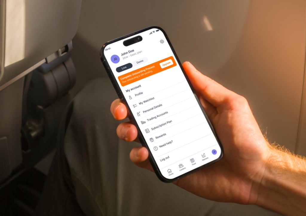
The worst leak was the KYC handoff. The moment the screen changed into a third-party environment, people lost the thread and lost their confidence at the same time. So I rebuilt the onboarding architecture around that handoff instead of pretending it was not there. Clear expectations at every stage, less perceived effort before the jump, the external step framed as part of the process rather than an interruption. The aim was for the user to feel held the whole way through, even across a boundary I did not control.
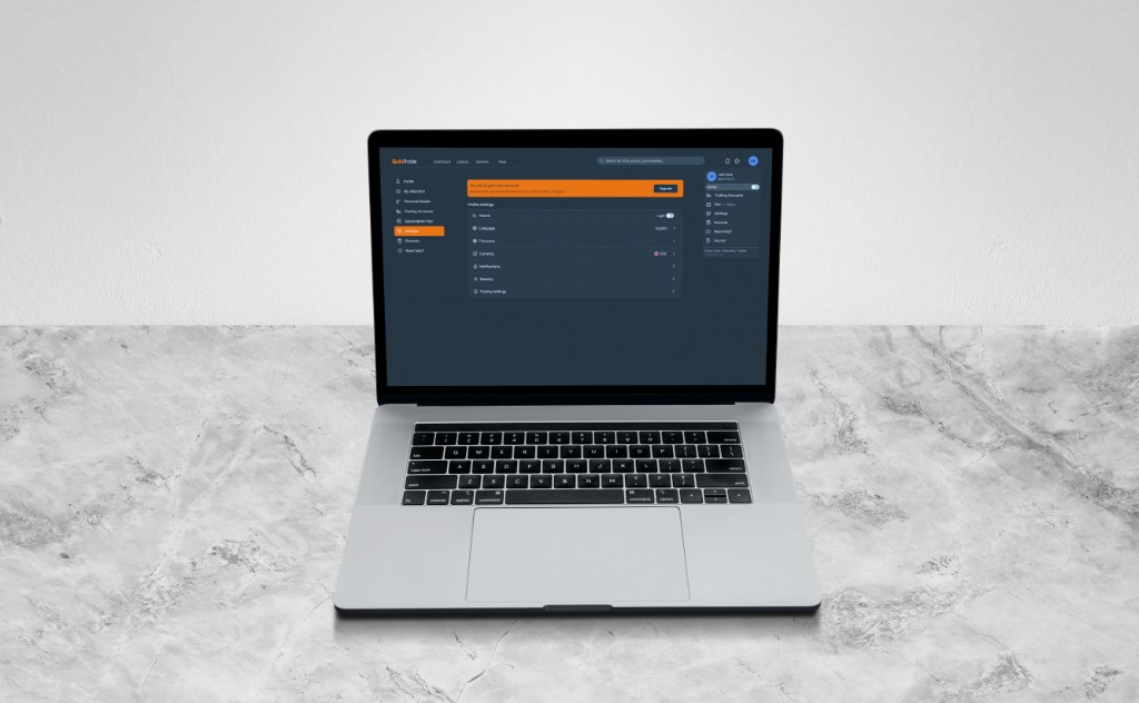
The terminal that shouted everything at once
The Trading Terminal was legitimately dense. Price charts, signal feeds, copy-trade portfolios, order management, all on one screen. The problem was not the amount of data. It was that everything carried the same visual weight, so nothing led. I introduced hierarchy: the core actions up front, the advanced tooling progressive, and Copy Trading promoted as the primary way new users discovered the product, which is exactly what the data already showed they wanted. I was not adding. I was deciding what mattered most, and saying no to everything else having an equal claim on the screen.
The system, built from the ground up
Underneath all of it, I built the ZuluTrade design system from scratch. Tokens, component rules, documentation across Web and React Native. Charts, social feeds, portfolios, and the terminal all sharing one structural language. That coherence is what later made white-label partnerships possible, and let the system stretch to the Capital Wallet crypto integration without breaking.
What it actually taught me
Here is the real story under the metrics.
I went into ZuluTrade believing the job was the UI. Make the screens good and the rest would follow. The project taught me, the hard way and under a lot of pressure, that the screens were the smallest part of it. The work that mattered was getting people to understand the why behind a decision. Managing stakeholders. Making them aware of what I was doing and why, instead of quietly doing the work and hoping they would notice. Saying no to the things that would have pulled the UX out of shape, and being able to defend that no with the data.
Nobody hands a junior that lesson gently. I learned it by being thrown in and feeling, daily, the gap between designing something and getting an organisation to move with you.
If I went back, I would take smaller steps. I would carry less of it as stress. But I would not undo it. This is the project that turned me from someone who makes screens into someone who can hold a product, because it forced me to, well before I felt ready.
The numbers
- −32% drop-off at the external KYC step
- +29% new-user activation after the funnel restructure
- −50% design-to-development handoff time once the system was in place
- White-label partnerships unlocked through component modularity
Gallery
Outcomes

