
Insurtech
Anytime by Interamerican — Designing a consumer app for a regulated industry, and learning how a whole country relates to insurance
The less you know about an industry the day you walk in, the more clearly you can see what is wrong with it. Six-month MVP, 150,000+ downloads, claims moved from multi-day paperwork to same-day in-app. Three countries on one system — and a lesson in how a whole country relates to insurance.
Scope
I have spent most of my career designing inside regulated industries. Fintech, banking, trading, insurance. Places where a wrong screen is not only bad experience, it is a compliance problem, a legal exposure, a phone call from someone's lawyer. You learn to design with one hand on the brake.
And the strangest thing those years have taught me is this. The less you know about an industry the day you walk in, the more clearly you can see what is wrong with it.
Anytime is the clearest example I have.
Arriving
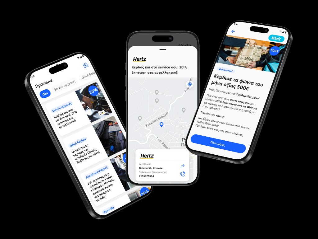
Interamerican is the largest general insurer in Greece. Fifty years of history, millions of policies in force, and, when I arrived through Code.Hub in 2023, no consumer mobile app. They wanted to build one, and they wanted someone to own it.
The assumption walking into a company like that is rigidity. A young designer telling a fifty-year-old institution how mobile works, and getting told to wait their turn. I joined expecting a fight. The fight never came. They handed me full ownership of a product that did not exist yet and made room for me to build it. They had never done mobile. What they had instead was a willingness to listen, to learn, and to give me space. I kept waiting for the resistance. It did not arrive.
The hard part was never the institution. It was the blank page.
My own experience with insurance, the day I started, was a single policy on my car. That was the whole of it. And I was about to design the consumer face of the country's largest general insurer. The team building it with me, five developers, was new to the project too, so none of us inherited a map. We drew it. The features, the guidelines, the reasons behind each one, all of it from nothing. That was the challenge. Not the company. The empty space where the product was supposed to be.
The outsider has a short shelf life
People treat an outsider designer as a gap to close. I have learned to treat it as a tool with an expiry date.
Before I learned the industry well enough to think like it, I could still see it the way a customer does. That is exactly when the blind spots are easiest to find. Insiders stop noticing what they have long since accepted. The friction everyone in the building has made peace with becomes invisible to them. I had made peace with nothing yet, so I could still feel it.
When you are deep inside a project, biased by everything you now know, the real pain points are the hardest things to see. They hide behind the explanations you have learned to accept. So the first job was not design. It was understanding. I spent that short window, the stretch where I was still naive enough to be useful, studying the business and studying the people, mapping where the real pain lived before I lost the ability to feel it.
What insurance actually is to people
Here is the thing the research kept circling back to, and the thing I believe the insiders had stopped seeing because they live inside it.
Greek customers do not experience insurance the way Western fintech assumes. Insurance is not a product people enjoy. It is a tax they pay because they have to. A piece of paper that lives in a drawer until something goes wrong. An interaction loaded with dread before the user has even opened the app.
That reframed the whole problem. The hardest thing here was never the feature list. It was making a digital insurance interaction feel as safe as a branch visit, for people who, until very recently, would only have dealt with insurance in person, on paper, with a signature and a stamp.
Every meaningful decision came back to that. Iconography that signalled permanence rather than startup energy. Confirmations that felt like the close of a paper transaction. Language that leaned formal and precise rather than casual. Moments that deliberately slowed the user down where the stakes were high, instead of rushing them through.
The time problem, and the system I refused to build first
The mandate was a six-month MVP, from idea to launch. We built the app in parallel with the development team, which meant I had to stay ahead of the build. Two to three sprints ahead, always, so the developers never ran out of screens to work on. That pace set the terms for every decision that followed.
Usually, when you start a product, you start by building the base of the design system. The full set of components, then the app on top. On this project, with deadlines that tight on both sides, I made a decision that felt wrong at the time. I would not build the base first.
I started with foundations. Then I built only the atoms and molecules the first screens actually needed, and nothing else. The design system grew in parallel with the product, component by component, each one created the moment it was required and not a moment before.
At first it felt like working without a floor. Three years later, I can see what the decision bought us. We never built irrelevant components. Nothing redundant, nothing speculative, nothing sitting in the file because some style guide said it should exist. I was cautious about every new component, and the test was always need, never industry standard. The alternative, the one the textbook recommends, is eighty atoms built to a spec, half of them redundant, most of them never used, gathering dust while the deadline burns. We did not have that. Every piece of the system earned its place by being needed.
One designer, five developers
One designer cannot out-draw five developers working full speed. So I did not try to win on volume. I won on sequence.
Every flow started before a single screen existed, in a room with backend, payments, claims, and, for road assistance, the operational team that handles real roadside callouts. What was technically feasible, what the regulation required, what the operation could actually support, all of it got decided first. By the time I was drawing wireframes, the structure was already half made. That is what lets one designer keep pace with a full development team. You do the hardest thinking upstream, where it is cheap, not downstream in pixels, where it is expensive.
There was no dedicated research function, so I ran my own. Competitor audits across Greek and European insurers. Interviews with policyholders during scoping. Usability testing on the flows that mattered most, claims and road assistance, before launch. Where I could not run formal research, I leaned on modern tools to fill the gap. NotebookLM to synthesise internal documentation, Claude and Cursor to move faster through prototyping, Perplexity to scan the market. A stand-in for the function I did not have, never a substitute for talking to a real person.
And then the part that quietly protects a product: saying no. The highest-leverage skill in solo design at scale is not how fast you draw. It is how often you refuse a feature that would fragment the system. Every request met the same question. Does this make the product more coherent, or more fragmented? Coherent went on the roadmap. Fragmented did not, no matter who asked.
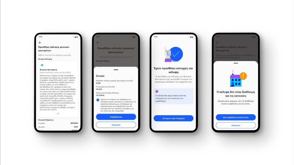
The button we almost got wrong
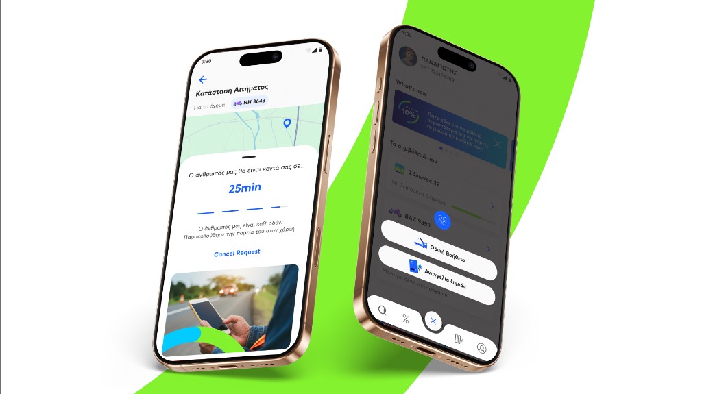
The hardest single decision was the emergency button.
Everyone's first instinct was the same. A panic button. Big, loud, impossible to miss the first time you open the app. The logic felt obvious. If someone is in trouble, make the way out enormous.
I was not sure. We ran early surveys and user testing, and the results did not settle it. My own instinct said the button should carry some weight, some caution. But the longer I sat with it, the more the obvious answer looked like a trap. A button that shouts emergency every time you open the app does not make people feel safe. It makes the product feel like a place where something is about to go wrong. You would be priming panic in someone who only wanted to check their policy.
The button has to be the first thing you can find in a crisis. It cannot be the first thing you feel in calm.
So we did not make it loud. We made it permanent. A central button in the main navigation, prominent but never alarming, marked with a shield and an exclamation so it reads as help is here, not danger is coming. Always in the same place. Regular users learn it without thinking, so that on the one day they actually need it, their thumb already knows where to go.
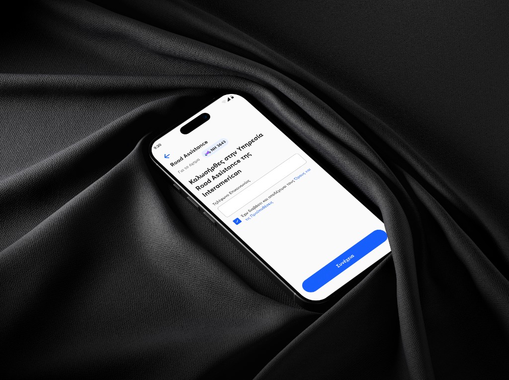
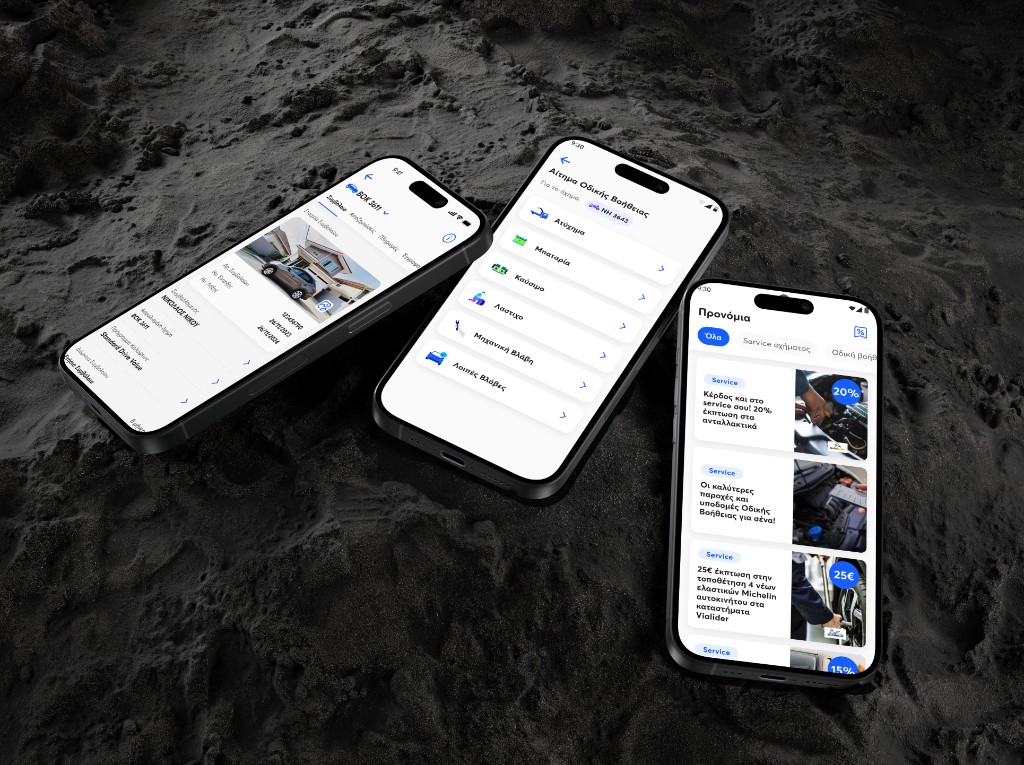
Road Assistance, designed for a shaking hand
The button opens into Road Assistance, and Road Assistance is the flow I am proudest of. It is the one people use during or after an actual roadside emergency. A flat tire. An accident. A breakdown on a motorway at midnight. The user is stressed, somewhere they do not want to be, using a flow they have never seen before, because something has gone wrong.
The discipline here is not reducing clicks. It is reducing the thinking to almost nothing. Location detected automatically, with a manual override. Vehicle pre-filled from the policy. Service type narrowed to the few most requested options, with an escape hatch for everything else.
The back and forth lived in those options. We kept wanting to give people more. A line of context under each choice, a short description, something to help them pick correctly. Every version of that instinct lost. The person on this screen is not reading. They are in a hurry and a little frightened, and every word you add to help them is one more word they have to get past first. So we stripped it to short, clear choices. The help was in the brevity, not in the explanation.
The result is a flow that takes under thirty seconds in the worst real-world case, and survives being used by someone whose hands are shaking. That is the bar. Anything slower is the wrong design for this person, in this state.
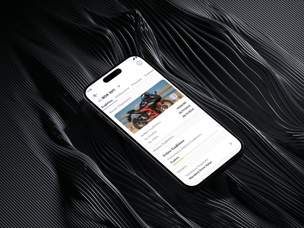
Claims, from a multi-day process to a same-day one
Claims used to take days. Phone calls, forms, branch visits, witness signatures, document scans. The shipped claims flow brought it down to same-day, in-app. Photos uploaded straight from the device. Structured questions in place of free-form paperwork. Status updates in the user's hand instead of in a phone queue.
The work here was not visual. It was structural. Every paper step had to be replaced with a digital one that still satisfied the same regulatory and evidentiary requirements, and the language of insurance had to be translated into something a stressed person could parse on a phone.
The audience nobody designed for
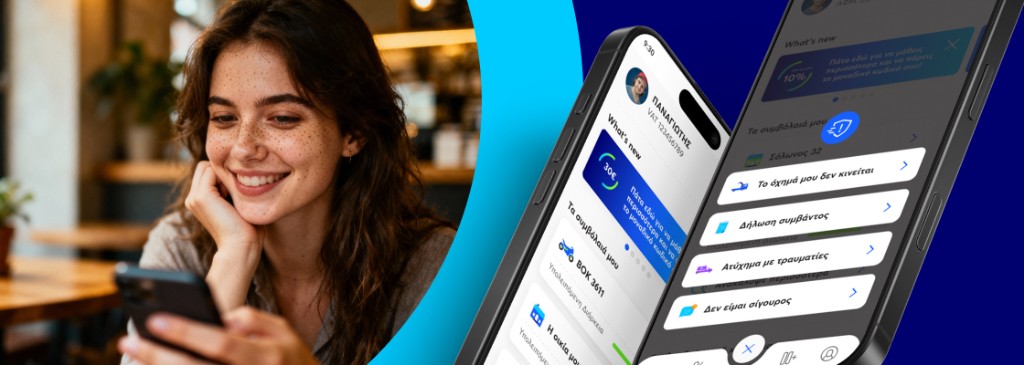
The dread is real, and it shaped the first version. But once the product was live, it started telling us things the research never could.
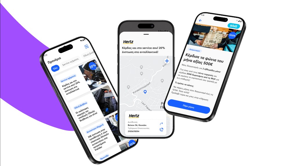
The data surfaced an audience nobody had built for. Younger users, the kind who actually like their car. For them the policy was not only a bill. It was attached to something they were proud of. So we gave them a small thing. A cover image for the policy, set to a photo of the car itself, living inside the app. It sounds minor. It was not. They used it. A grudge purchase had quietly become something a few of them wanted to open and look at.
That is what the second phase was really about. Not adding features for their own sake. Reading what the live product was telling us, watching how existing users actually behaved, finding the audiences we had not expected, and letting the data, not the original plan, decide what the next version should be.
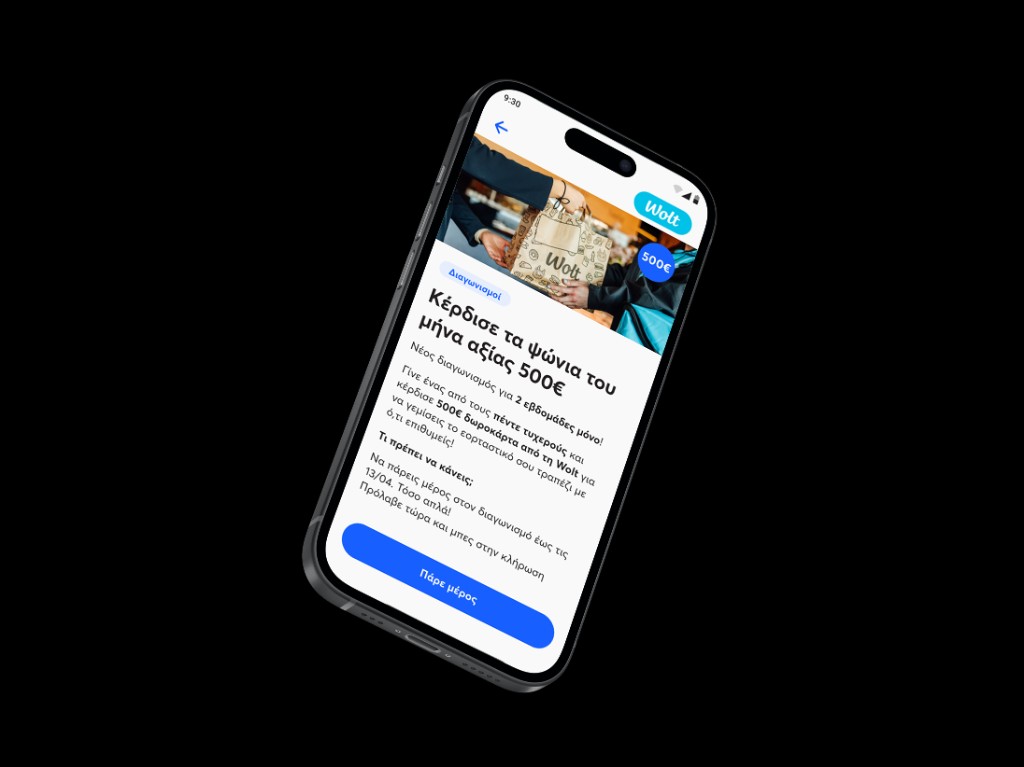
Greece, then Cyprus, then Romania
Once the second Greek version was stable, the system was strong enough to travel. Cyprus launched on the same foundation. Romania followed.
Cyprus is not Greece with a different flag. Its insurance regulation diverges in the places that matter most to a product like this. How claims are handled, how policies are structured, what has to be disclosed and when. On the surface the two apps look like siblings. Underneath, every flow that touched regulation had to be rebuilt to the local rule.
And the regulation is only the visible half. This is the part I find most interesting, and the part most people underestimate. The patterns are global. The experience stays consistent from one country to the next, and it should. But the business needs are genuinely different, because the socioeconomic situations are different, and that means the people's needs are different in every market. Keeping the experience coherent while letting each country have what it actually requires is the real work. Localisation is not translation. It is the turning point where a Greek product becomes a platform.
The thing that made it possible was the same restraint from the beginning. The system was built to absorb that variance without forking. Country-specific flows live as configurations on shared components, not as parallel products.
What the work taught me
The app shipped, and the numbers are good. A six-month MVP from idea to launch. More than 50,000 downloads in the first year, past 150,000 within two, after the second version. Claims that once took days reduced to the same afternoon. One designer, growing into the design lead across three platforms over three years. But the numbers are the visible output, and they were never the point.
What I took from Anytime is a way of working inside industries that are not mine. You arrive knowing nothing, and you treat that as the asset it is, for the short time it lasts. You study how people actually behave before you study how the industry says they should. You build only what the product in front of you needs, and you refuse the rest, even when a style guide tells you otherwise. And you remember that in a regulated business, the job is never to remove the rules. It is to make the rules feel like care instead of friction.
That is the work. The screens are what people see. The understanding underneath them is what makes the screens worth seeing, and what decides whether the product survives the next ten people who join after you.
Gallery
Outcomes
